Hawaiian Sweet Potato Factory
Hawaiian Sweet Potato Factory specializes in sweet potato products such as sweet potato pies, baked sweet potato and sandwiches made of sweet potato bread. This is the overseas flagship shop for this Japanese company. They are not only introducing sweet potato products to Hawaii, but also are sourcing their sweet potatoes from local farmers. Their goal: provide fresh and healthy farm to the table products.
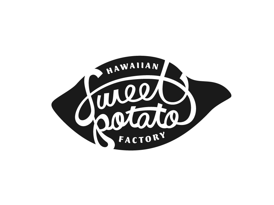
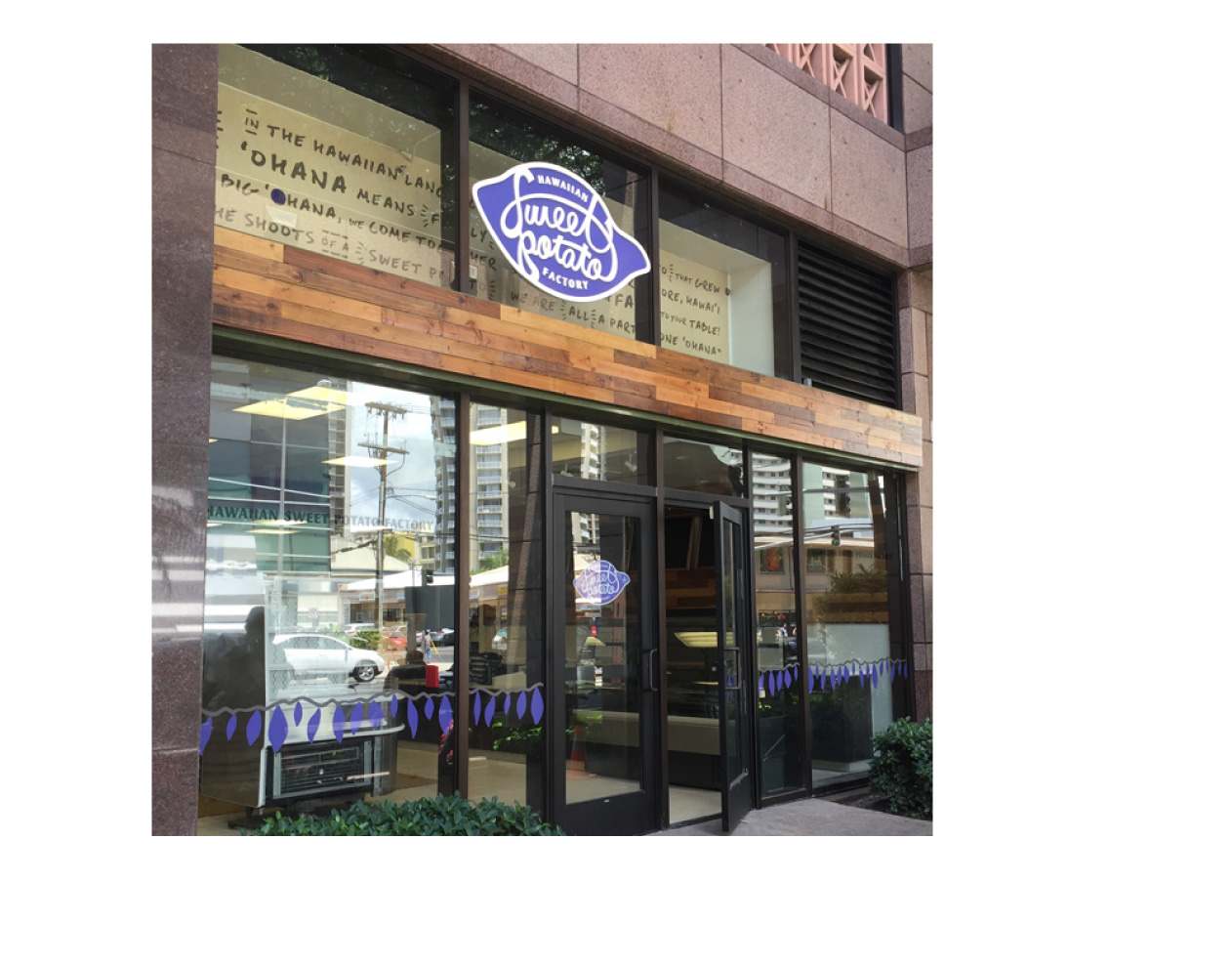
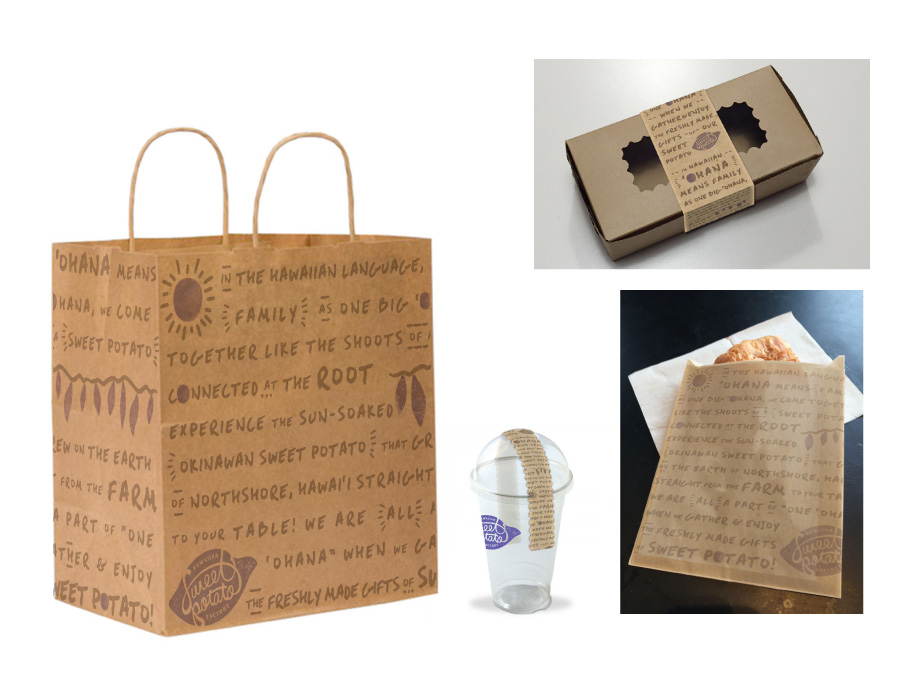
The sweet potato shaped logo with handwritten letters communicates their product in a playful and easy to understand way. The brand visual: illustration on earthy kraft paper and the copy tells it all. Their delicious sweet potato products bring people together like family. The visual of a bunch of sweet potatoes connected by stems which is used for packaging and store window represents ʻohana: family, friends and community.
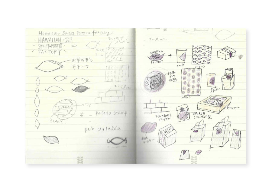
Working on their various branding items from the logo, package design, to the store visuals including interior graphics, window graphics and the store signage was a real rewarding and fun experience.
[Done while at Clarence Lee Design.]
Client
Shirohato USA Inc.
Art Director
Kuni Yamamoto
Designer
Etsuko Ono, Hirona Ogawa
Date
July 3, 2017
Category
Brand, Design, Identity


